Wednesday 5 August 2015

Even More Summer Watercolours

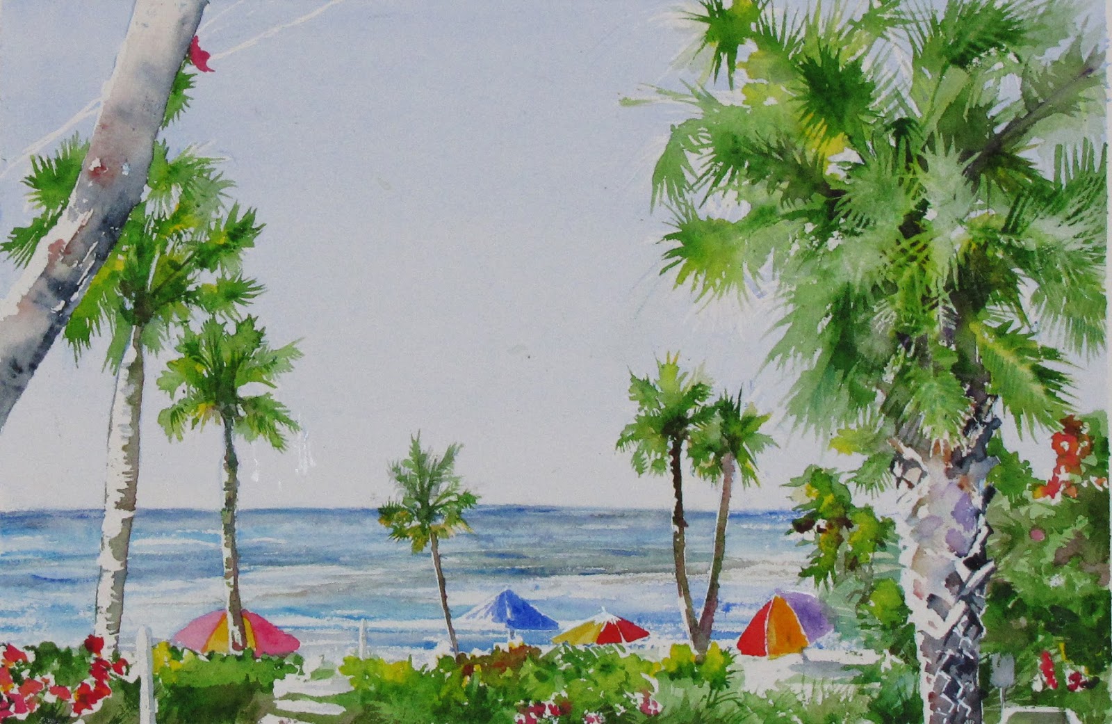
Poolside, Watercolour on Aquabord,
© alisonmoonillustration 2015
 There's something about painting in a different country, or actually, just being somewhere different. The lighting, I think, is the big 'thing' for me, as creating a feel of freshness has always been a concern of mine. Maybe it's the novelty factor as well, but I don't think anyone should be expected to be creative while being stuck in one place. But I believe that art is subjective: what suits one person might not suit another.

For this first piece, it was my first proper experiment with Ampersand's 'Aquabord' (see their website) a clay coated surface that feels like a cross between, oddly enough, soft fabric and fine grit sandpaper - or if sandpaper could be described as 'velvety'. Softly gritty, maybe. You can actually sand the surface as well to make it smoother like hot press paper, but I have yet to try that

Side Street in Spain, Watercolour, © alisonmoonillustration 2015
Personally comparing it to paper, it was quite a different experience - I didn't have to worry about paper buckling and I was able to do really detailed initial drawings that I could rub out really vigorously without causing damage.

Glazing was also good fun, as the surface really took hold of the colour, fixing it in place so layers could apply more easily without disturbing previous ones. Also, lifting with a stiff bristle brush was, as advertised, easy to do. I don't know how both properties can exist, but there you have it.

To me, though, it just wasn't quite as nice to work with as paper - my surface of choice remains a stretched 300gsm rough watercolour paper. How the colours sit and blend, particularly when using wet on wet techniques just feels more comfortable and less resistant on paper. Perhaps that's just bias speaking, but I found applying washes onto the aquabord somewhat frustrating, and streaking appearing where the brush (squirrel hair, in this case) moved across the surface where it wouldn't occur on paper.


On an end note, I think I might try to sand an aquabord panel before I make any final personal judgement, and it's worth knowing that if I ever wanted to do a mixed media and textural piece with watercolour, Ampersand is a nice sturdy option that will also travel outside well.

Quintessentially Timacuan, Watercolour, © alisonmoonillustration 2015

Days of British Summer at Polesden Lacey, Watercolour on Aquabord, © alisonmoonillustration 2015

Thursday 30 July 2015

Out in the open air this summer...

So, while we had the lovely weather (it was nice while it lasted at least) I thought to try my hand at improving my water colour painting skills. Some were done at the location, others in the studio.This is how it went...

A Lake in Bushy Park, ©alisonmoonillustration 2015

From the Lido Key Dorset, Florida ©alisonmoonillustration 2015


 So all in all, good fun. I'd like to think I've improved over the last couple of months anyway. In particular, I think water colour can be a tricky medium to get a hang of - for every painting I've done there have been just as many mistakes (sometimes more...)

This one, for instance took three tries. But I didn't actually write that!


Ringling House, ©alisonmoonillustration 2015


Trail to a medieval village, Yorkshire Wolds©alisonmoonillustration 2015


Spanish Moss, ©alisonmoonillustration 2015

Tuesday 17 February 2015

A Seal of Approval

Trying out those coloured pencils: Faber-Castell Polychromos


Polychromos pencils on cartridge paper, copyright 2015 Alison Moon Illustration

So, this week, having got a lovely set of Faber-Castell polychromos water resistant pencils for Christmas, I finally found that I had the time to actually give them a go. So I did, and had enormous fun while doing so.

And the first thing I noticed? They were so easy to blend, and it was literally twenty minutes into working before I realised that I had to sharpen them again. I worked in layers with this piece, and used Zest-It solvent to blend, which worked very well over the 200gsm cartridge paper I used. I was quite happy to find that there was no paper discoloration where the solvent bled as well.

In terms of smudging, I noticed that there was a little issue with the dark colours on the seal's markings. I found that the pigment tended to cling to the skin of my palm, but it certainly wasn't anything major and was easily solved with a little tracing paper.

Once all the colour was layered as needed, I finished up the details with a titanium white Liquitex marker, which I found that did a nice job of pushing back the colour where the light hit the animal's fur.
So, Overall, it was a lovely experience - definitely one that I'll be using again. 

Thursday 5 February 2015

The Folio Collection of Ghost Stories Competition Entry

The Folio Illustrated Book Competition 2015


This Years' competition brief was to design three illustrations and a book cover for an anthology of ghost stories - always a fun theme to illustrate,

so I thought I'd give entering a go.


For the front cover design, the challenge for me was to come up with something graphic and interesting. I love Gothic style imagery, and since the stories featured all had a Victorian or Edwardian feel to the writing. To find out more about the stories and the competition itself, here is the link:

 http://competitions.houseofillustration.org.uk/book-illustration-competition-2015/about-the-book/

I felt that old fashioned was a good way to go. In the end I chose a raven to make use of the symbolism and the appropriate link to the poem 'The Raven' by Edgar Allen Poe.  


The Abbott's Treasure by M. R. James
Mixed Media


The Upper Berth by F. Marion. Crawford
Mixed Media


A Tale of an Empty House by E. F. Benson
Mixed Media


Overall, I'm happy with what I've done, and i was glad to get stuck into an intensive project again. More of my work can be seen at http://www.alisonmoonillustration.com


Wednesday 4 February 2015

A New Blog

It's Time for a Fresh Start


It's a New Year (somewhat) and that fresh start feeling has yet to go stale, so I'm starting this blog as a space to experiment - because sometimes art really just needs to be done for the sake of art.

2014 was a good year for drawing - I discovered what has to be one of my favourite combinations of artistic media: Copic markers on stone paper, which blend beautifully and doesn't experience any bleed through. For those of you who have ever used alcohol based markers - you'll know what I mean.

So here is a zebra from the sketchbook, to officially say goodbye to the Year of the Horse.